Everything used to be better before?
The structure of websites feels more and more similar. Especially the design and user interface of mobile websites, which are optimized for small screens, are very much alike. We at EYEVIDO have asked ourselves how this similarity affects the usability and if we can measure the difference with eye tracking. We sent a group of testers on a time travel and made them solve everyday tasks on 20 year old websites.
Thanks to the “Wayback Machine”, a digital web archive, it is possible to visit web pages in their original state, at the turn of the millennium. The study compared ebay.com from the year 2000 and bahn.de from the year 2001 with their current versions in the year 2020.
Thanks to EYEVIDO Lab, the live websites were able to be tested just by entering the URL. No special adaptation was needed. In addition to eye tracking data, mouse movements and clicks were recorded for each website.
Example eBay
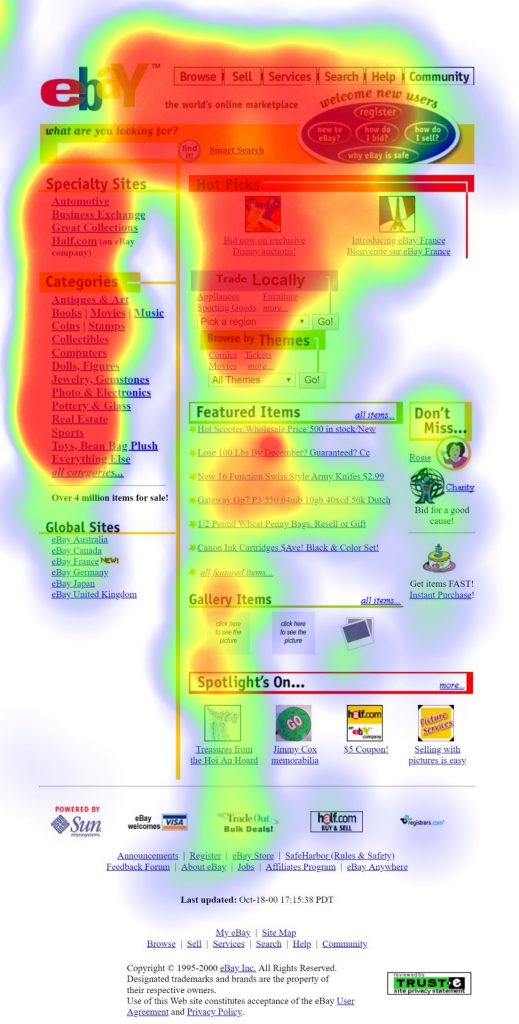
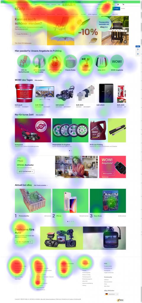
Gaze data of all testers on eBay from the year 2000 (left) and today’s eBay (right).
On eBay, the testers were asked to purchase a certain item. Our aim was to find out, how long this process would take. The overlaid views of all testers on the heatmap, clearly show that the attention is largely distributed on the individual menu items on the retro version (left). The titles of these individual elements were read, but do not play a role in the purchase decision making process. All in all, attention is lost on a multitude of irrelevant information. In comparison, the gaze data on the current eBay version show that the distribution of attention is much more focused and that on average, the entry is faster. The item description was found 8s faster (Ø15s) than on the retro version of eBay (Ø22s).
Example Bahn.de
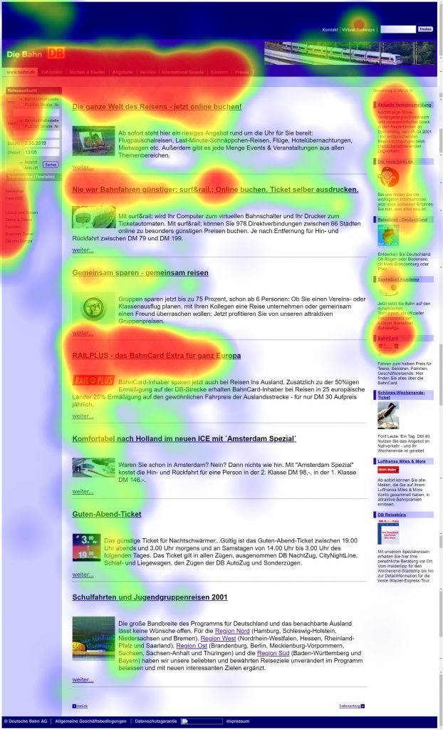
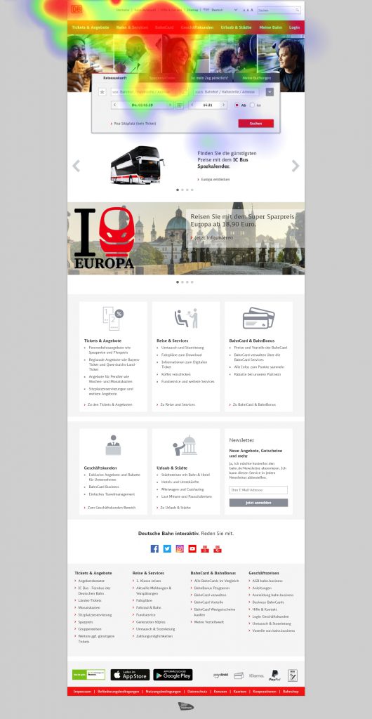
Gaze data of all testers on “bahn.de” from the year 2001 (left) and today’s bahn.de (right).
Testers were tasked to find out information about the Bahncard on the current and on the retro version of the website. Disoriented the eyes of the test persons wandered around on the retro homepage. The scattered attention on the heat map (left) shows again a similar picture as before. On average 22s were needed for the task.
The results of the gaze data on the current version of the DB website look completely different: Here, the heat map (right) immediately shows the clear concentration of attention. The desired web element was found on average within 5s.
Bottom line
The usability of today is not the same as it was 20 years ago. The reasons for this are probably due to technical changes and constant optimization. A user from the year 2000 might have found it easier to use websites from his own timeline. But the differences were so obvious that the slower user navigation of old websites cannot be solely attributed to a lack of habit. By means of eye tracking we could clearly show how unimportant menus on the left, right and bottom, as well as unstructured information distributed all over the page, catch the user’s eyes for an unnecessarily long time.
Well, eBay and Deutsche Bahn have learned the valuable lesson of usability over the last twenty years and have optimized their online presences for user-friendliness. The time of design experiments seems to be over. For the long-term success of a site, excellent user-friendliness is a top priority. The key factors are clarity, clear structures and intuitive operation. So now, we can answer the initial question clearly, at least from a usability point of view. No, not everything was better in the past.